youtube-clone
Frontend Mentor - YouTube Clone

This is a YouTube Clone.
Table of contents
Overview
The challenge
Users should be able to:
- View the optimal layout depending on their device’s screen size
- See hover states for all interactive elements on the page
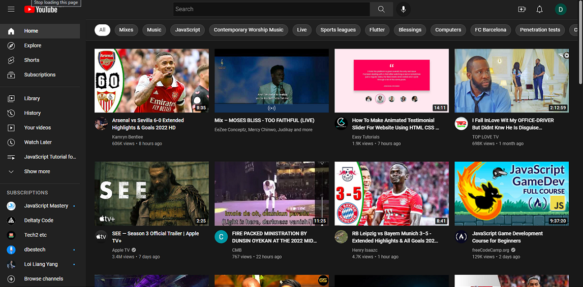
Screenshots

Links
- Solution URL: Frontend Mentor
- Live Site URL: Github
My process
Built with
- Semantic HTML5 markup
- CSS custom properties
- Scss
- CSS Grid
- Flexbox
- JavaScript
Layout
The designs were created to the following widths:
- Mobile: 375px
- Desktop: 1140px
Author
- Frontend Mentor - @kinjames
- Twitter - @TheBlackCoder7